
How to Add a Background to an Image: The 2026 Guide That Makes It Actually Look Real
November 4, 2026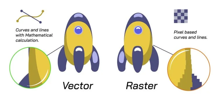
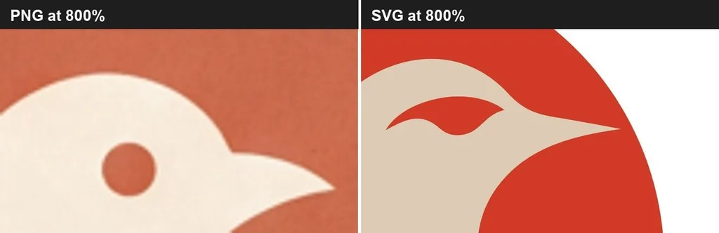
Vectorizing an image means turning a pixel-based file (JPG, PNG, GIF — anything that gets blurry when you zoom in) into a vector file made of mathematical curves and shapes (SVG, EPS, AI, PDF). A vector stays razor-sharp at any size — from a business card to a billboard — and you can edit every shape and color individually. You do it one of four ways: auto-trace in Illustrator (fast, needs cleanup), manual pen-tool redraw (perfect, slow), free tools like Inkscape (budget option), or AI online vectorizers (cheap and fast for simple art). For logos and anything going to print or a cutting machine, auto-trace alone is rarely enough — you’ll need to clean it up, or hand it to a pro.
Vectorize Picture
PNG · JPG · WebP → real SVG paths · all in your browserDrop your picture here
PNG, JPG, JPEG or WebP · up to 25 MB
Vectorize Picture
Adjust the settings, watch the preview, export the SVG.Presets
Trace mode
Background
Processing
Advanced options▾
Export your SVG
Copy, download or share — every path is real vector geometry.- What Does "Vectorize" Even Mean?
- Why You'd Need to Vectorize Something
- The Four Methods, Compared
- Method 1: Illustrator Image Trace — Step by Step
- Prep Your Image First — It Makes All the Difference
- Method 2: Inkscape — The Free Option
- Method 3: Photoshop — The Workaround
- Method 4: Manual Pen-Tool Redraw — When Auto Fails
- Cleaning Up Your Vector — The Step Beginners Skip
- File Formats: Which One to Deliver
- By Use Case: Settings That Matter
- The 7 Mistakes That Ruin a Vectorization
- When to Just Outsource It
- Frequently Asked Questions
- Final Thought
What Does “Vectorize” Even Mean?
Here’s the thing nobody explains clearly. Every image on your computer is one of two types.
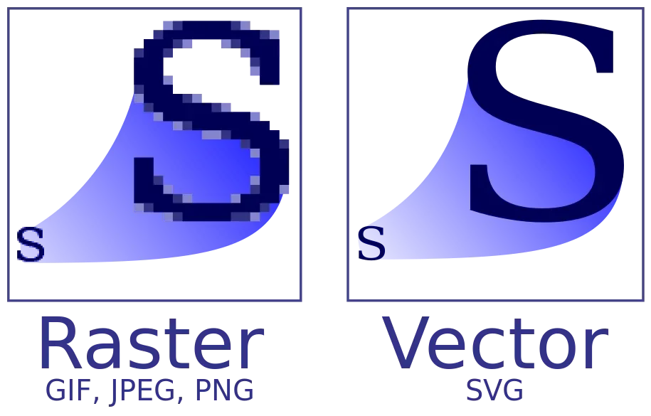
A raster image — JPG, PNG, GIF, BMP, WebP — is a grid of tiny colored squares called pixels. Zoom in far enough and you see the squares. It has a fixed resolution, and making it bigger just makes the squares bigger. That’s why a logo pulled from a website looks like garbage on a t-shirt.
A vector image — SVG, EPS, AI, PDF, DXF — stores drawing instructions instead. “A red circle here, a curve to there, a blue fill.” There are no pixels. The math recalculates at any size, so edges stay smooth forever. You can also select each shape and change its color, move it, or delete it — something you can never do with a flattened JPG.
To vectorize is to rebuild those drawing instructions from the pixels. The software (or a human) looks at where one color ends and another begins, and draws a path along that edge. Do that for every edge in the image, and you’ve got a vector.
Why You’d Need to Vectorize Something
You’ll hit this wall eventually. The most common scenarios:
- Your logo only exists as a PNG or JPG. The printer, sign shop, or embroiderer asks for a vector file and you have nothing. This is the number one reason people search for this.
- You’re cutting vinyl, HTV, cardstock, wood, or acrylic with a Cricut, Silhouette, Glowforge, or laser cutter. These machines follow paths — they literally cannot use a pixel file.
- You need it on a storefront sign, uniform, or screen print. Anything scaled large or applied to a physical object needs a vector.
- You want to change the colors of a design without redrawing it, or separate it into layers for a multi-color print.
- You need a light, sharp icon or logo for a website. An SVG is usually smaller than a PNG and stays crisp on retina screens.
If any of those sound familiar, keep reading. A solid raster vs vector explainer will go deeper on the file-type differences if you want the full technical breakdown.
The Four Methods, Compared
Before you dive in, know what you’re picking. Each method trades speed against quality.
| Method | Time | Cost | Best For | Quality |
|---|---|---|---|---|
| Illustrator Image Trace (auto) | 5–15 min + cleanup | Subscription | Logos, line art, flat-color illustrations | Good, needs cleanup |
| Manual pen-tool redraw | 30 min–several hours | Subscription or free | Complex logos, damaged art, production files | Perfect |
| Inkscape Trace Bitmap (free) | 10–20 min + cleanup | Free | Simple icons, web SVGs, hobby work | Decent, more cleanup |
| AI online vectorizer | 10–30 seconds | ~$3–10/image | Simple logos, fast turnaround | Good for flat color |
The honest truth: every auto-trace tool — no matter how good — is an approximation. It reads pixel edges and guesses where to draw paths. The result always needs inspection, and usually needs cleanup. If your file is going to print production, embroidery, cutting, or any commercial use, you’ll need to clean the output or hire someone who will. That’s not you failing — it’s the tool’s ceiling.
Method 1: Illustrator Image Trace — Step by Step
This is the industry standard. Illustrator’s Image Trace (formerly Live Trace) is the most capable auto-tracer out there. Here’s the exact workflow.
Step 1: Place your image. Open Illustrator, go to File > Place, and drop your raster image onto the artboard. Don’t just open the JPG directly — Place keeps it as a linked object you can trace.
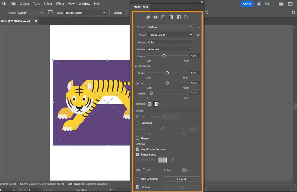
Step 2: Open the Image Trace panel. Window > Image Trace. Check the Preview box at the bottom so you see changes live.
Step 3: Pick a preset. The presets at the top do 80% of the work. Choose based on what you’re tracing:
- Black and White Logo — for one-color logos, text, silhouettes. Check “Ignore White” so the background doesn’t become a shape you have to delete.
- 3 Colors / 6 Colors — for simple multi-color logos. Start low and add colors only if you lose detail.
- 16 Colors / High Fidelity Photo — for detailed illustrations. Warning: this generates huge files with thousands of anchor points.
- Line Art / Technical Drawing / Sketched Art — for scans of drawings and blueprints. You get outlines instead of filled shapes.
Step 4: Dial in the advanced settings. This is where the magic happens. Expand the Advanced section:
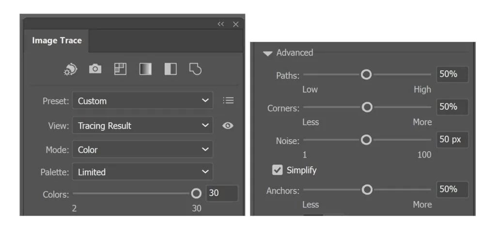
- Paths (~50%): Higher = tighter fit to pixels but more anchor points. Lower = smoother curves but you may lose sharp corners. 50% is a safe start.
- Corners (~75%): Higher = preserves sharp angles. Lower = rounds everything off. For geometric logos, push it higher.
- Noise (25px+): The minimum pixel area Illustrator will trace. Crank this up to ignore dust, JPEG artifacts, and specks.
- Threshold (black & white only): Adjusts where gray becomes black vs white. Slide until lines look right in preview.
For a typical solid-color logo, start here: Mode = Color, Palette = Limited, Colors = match your actual ink count, Paths 50%, Corners 75%, Noise 25px+, Simplify checked.
Step 5: Trace. Uncheck Preview to activate the Trace button, then click it. Wait a few seconds.
Step 6: Expand. This is the step everyone forgets. Illustrator has traced it, but it’s still a temporary object. With it selected, go to Object > Expand (or click Expand in the control bar). Now you have real vector paths. You’ll see blue outlines everywhere.
Step 7: Ungroup and clean. Right-click > Ungroup (you may need to do it twice). Now you can select and delete the background shape, remove stray fragments, and simplify paths. We’ll cover cleanup in detail below.
Step 8: Save. Save a working AI file, then File > Save As and choose SVG for web/cutting, EPS or PDF for print.
The official Image Trace guide covers the newer Enhanced Presets (gradient support, auto-grouping, transparency) if you’re on the latest Illustrator.
Prep Your Image First — It Makes All the Difference
Garbage in, garbage out. Spend two minutes prepping and you’ll save an hour of cleanup.
- Use the largest, highest-res version you can find. A 2000px-wide logo traces far better than a 200px one. Below ~500px on the long side, fine details disappear.
- Crop tight. The tracer tries to trace everything it sees — background noise, shadows, artifacts. A tight crop gives it less to misinterpret.
- Remove or flatten the background. If possible, give it a solid white or transparent background. Busy backgrounds create thousands of stray vector shapes.
- Boost contrast. If edges are fuzzy, open it in Photoshop or any editor and pull the Levels sliders inward so shapes pop from the background. If you’re not sure which tools do what, a Photoshop tools overview will get you oriented.
- Reduce colors to the real count. If your logo is 3 inks but the JPG has anti-aliased edges creating 30 shades, reduce to 3 colors before tracing. The output will be cleaner.
Method 2: Inkscape — The Free Option
No Illustrator? No problem. Inkscape is free, open source, and runs on Windows, Mac, and Linux. Its Trace Bitmap uses the Potrace engine and works surprisingly well on simple art.
- Open Inkscape, File > Import your image (embed it).
- Select it, then Path > Trace Bitmap (Shift+Alt+B).
- For black-and-white art: Single scan > Brightness cutoff, adjust threshold. For color: Multiple scans > Colors, set number of scans to match your color count.
- Check Smooth, Stack scans, and Remove background.
- Click Apply (not OK — Apply keeps the dialog open so you can compare). The trace appears on top of the original.
- Clean up: Path > Simplify (Ctrl+L) to reduce nodes — press it multiple times. Use the Node tool (N) to fix distortions.
- Save as SVG (native), or export EPS/PDF.
The catch: Inkscape’s trace engine is noticeably weaker than Illustrator for complex or color images. Node counts run higher, curves are less smooth, color separation is less precise. For a quick web SVG of a simple icon, it’s fine. For production files, expect significant cleanup or a professional pass. Also note Inkscape doesn’t support CMYK natively — for professional print work, you’ll need to convert the color profile before delivery.
Method 3: Photoshop — The Workaround
Photoshop is a raster editor, so it can’t truly vectorize. But you can create paths from selections and export them. This works for simple shapes and logos when you don’t have Illustrator.
- Open your image in Photoshop. Use the Magic Wand or Quick Selection to select a color area.
- Go to the Paths panel, click “Make work path from selection.” Set tolerance to ~1.0 for smoother paths.
- Repeat for each color, creating a new work path each time.
- File > Export > Paths to Illustrator. This gives you an AI file with real vector paths you can open in Illustrator (or any vector app) and finish.
- Alternatively, use a Photoshop plugin like Image2Vector, which automates the shape-reduction and exports SVG/EPS directly.
This method is slow for anything multi-color, and the paths need serious smoothing. Treat it as a last resort. If you’re weighing which apps to learn at all, a graphic design software comparison will help you pick based on what you actually make.
Method 4: Manual Pen-Tool Redraw — When Auto Fails
Sometimes auto-trace just can’t get there. A low-res logo. A damaged old scan. A design with typography that needs to be perfect. Anything going on a billboard. In those cases, a human redraws it by hand with the Pen tool, and it’s the only method that guarantees perfect geometry.
Here’s how it works:
- Place the raster image on a locked layer, drop opacity to ~50%.
- Create a new layer above it.
- With the Pen tool (P), click to place anchor points at key corners. Click and drag to pull Bezier handles for curves.
- Close each shape by clicking the starting point. Fill it with the correct color.
- For text: delete the traced text entirely, retype it with the original font, then Type > Create Outlines to convert it to paths.
- Use as few anchor points as possible — a clean circle is 4 points, not 64.
A simple logo of 4–5 shapes takes an experienced designer 20–30 minutes. A complex illustration can take hours. But the result is flawless — mathematically perfect circles, consistent stroke widths, clean typography. This is what professional vector conversion services deliver, and it’s why they charge more than an online converter.
Cleaning Up Your Vector — The Step Beginners Skip
Auto-trace spits out a mess. Here’s the cleanup checklist that separates a usable file from a rejected one.
- Delete the background shape. Auto-trace almost always creates a big rectangle matching the image background. Select it and hit Delete. If you checked “Ignore White” during tracing, this is already done.
- Remove stray fragments. Zoom to 400%+ and hunt for tiny dots, specks, and broken shapes that aren’t part of the design. Delete them.
- Simplify paths. Object > Path > Simplify. A simple logo should have well under 100 anchor points total — if you see 2,000, simplify. An optimized SVG of a simple logo should weigh 5–30 KB; an unoptimized trace can exceed 500 KB.
- Fix the text. This is non-negotiable. Auto-trace cannot recognize fonts — it treats each letter as a random shape. You’ll get wobbly baselines, inconsistent stroke widths, and broken counters (the holes inside O, B, D). Delete any traced text and retype it in the original font, then convert to outlines.
- Check closed paths. For cutting and embroidery, every shape must be a closed path (last point connects back to first). Open paths make cutting machines lift the blade mid-cut.
- Verify color count. A 3-ink logo should be 3 layers, not 30. Use Select > Same > Fill Color to find duplicates and merge them.
- Test at scale. Zoom to 1000%. If edges look smooth and text reads clean, you’re done.
A good bitmap to vector step-by-step covers CorelDRAW’s PowerTRACE too, if you’re in a sign shop that runs on Corel.
File Formats: Which One to Deliver
You traced it — now what do you send? Match the format to the destination.
| Format | Best For | Notes |
|---|---|---|
| SVG | Web, Cricut, Silhouette, LightBurn, most printers | Universal, editable, small file size |
| EPS | Professional print shops, screen printers | Industry standard for print |
| AI | Working file, future edits | Native Illustrator format |
| Sending to clients, print production | Can contain vector + raster | |
| DXF | CAD, CNC, laser cutters, some embroidery | Pure path data, no fills |
Rule of thumb: save a master AI or SVG, then export to whatever the recipient asks for. The curves are the same in every format — it’s just packaging. If someone asks for EPS, AI, or PDF, open your SVG in any vector editor and export.
By Use Case: Settings That Matter
Where the vector is going changes how you build it.
- Print (business cards, signs, large format): Exact CMYK or Pantone colors, text outlined, export PDF or EPS. Set color values precisely so the printer hits your brand colors.
- Cutting machines (Cricut, Silhouette, laser): Solid fills only — no gradients. Background removed. One layer per color. Thin details must be at least ~1mm wide at final size or they’ll tear when weeding. Closed paths only. SVG is the universal format; some machines want DXF.
- Web and apps: Transparent background, optimized SVG (run it through SVGOMG to compress code). It’ll be lighter than a PNG and crisp on every screen.
- Embroidery and screen printing: Flat colors only, tiny details simplified. The machine needs one color layer per head.
If you’re preparing product images for an online store alongside vector work, an ecommerce product photo editing workflow often runs in parallel — clean product shots plus vector logos and packaging art.
The 7 Mistakes That Ruin a Vectorization
Every beginner makes these. Learn them now and skip the pain.
- Renaming a PNG to .svg. The file is still pixels — you just changed the extension. It does not become a vector.
- Using a “converter” that embeds the bitmap. Open the SVG in a text editor. If you see an
<image>tag, it’s not a real vector — it’s a JPG wearing an SVG costume. - Starting from the smallest copy. Always hunt for a larger version first. Resolution matters more than anything else.
- Keeping too many colors. A 3-ink logo should become 3 layers, not 30. Extra shades make printing and cutting a nightmare.
- Forgetting the background. A white rectangle behind a logo ruins stickers, engraving, and any dark-colored product.
- Not zooming in before using the file. Problems in small letters and thin lines only show up at high zoom. Always check at 400%+ before sending.
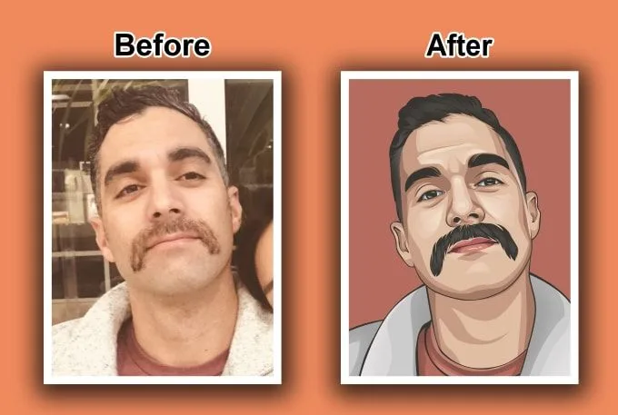
- Expecting a photo to become a perfect vector. Vectors are made of shapes; photos are made of millions of tones. You get a stylized flat-color illustration, not a faithful copy. That’s true for every tool.
When to Just Outsource It
Here’s the practical test. If you’ve followed every step and your traced result still has wobbly edges, broken text, excess nodes, or shapes that don’t match the original — you’re not doing anything wrong. You’re hitting the ceiling of what auto-trace can do. For logos, brand marks, and anything representing a business professionally in print or production, the fastest path to a clean result is often a professional hand-drawn conversion. A clipping path specialist or vector conversion team draws every path with the minimum clean anchor points, fixes typography properly, and delivers in every format you need — usually within 24 hours. It’s the difference between a file the printer accepts on the first try and three rounds of rejection emails.
If you’re already drowning in edit work across a photography business, the same logic applies — many studios outsource photo editing entirely so they can focus on shooting. Vectorization is just one more task in that category: technically doable yourself, but often not worth the hours.
Frequently Asked Questions
What does it mean to vectorize an image?
Vectorizing means converting a raster image (made of pixels — JPG, PNG, GIF) into vector graphics made of mathematical curves and shapes (SVG, EPS, AI, PDF). The result stays sharp at any size and can be edited shape by shape.
Can you vectorize a JPG or PNG?
Yes. Any raster image can be vectorized, but the quality depends on the source. A high-res, flat-color logo traces cleanly. A low-res photo becomes a stylized illustration, not a faithful copy.
What is the best way to vectorize an image?
For simple line art and flat-color logos, Illustrator’s Image Trace with cleanup is fastest. For complex or damaged logos, a manual pen-tool redraw by a designer is the only method that guarantees perfect results. AI online vectorizers are a cheap middle ground for simple art.
How do I vectorize an image for free?
Use Inkscape (free, open source) with its Trace Bitmap tool, or a free online vectorizer. Both work for simple icons and web SVGs, but expect more cleanup and weaker results on complex or color artwork.
Can Photoshop vectorize an image?
Not truly — Photoshop is a raster editor. You can create work paths from selections and export them to Illustrator, but it’s slow and the paths need heavy smoothing. Use Illustrator, Inkscape, or an online vectorizer instead.
What file format should a vectorized image be?
SVG is the most universal — it opens in every modern vector app and browser, and works with Cricut, Silhouette (Designer Edition), LightBurn, and most printers. Convert to PDF, EPS, AI, or DXF in a vector editor if your recipient asks for those.
How long does it take to vectorize an image?
With AI or auto-trace, seconds to a few minutes, plus cleanup. A manual redraw takes 30 minutes to several hours depending on complexity. A professional service typically delivers within 24 hours.
Does vectorizing improve image quality?
It removes pixels, so edges become smooth at any size — which usually looks cleaner than the original. But it cannot invent details that aren’t visible in the source image. Garbage in, garbage out still applies.
Final Thought
Vectorization is one of those skills that feels magical when it works and infuriating when it doesn’t. The auto-trace tools are better than ever, and AI vectorizers keep getting smarter — but the core truth hasn’t changed: a clean vector is built from clean input, and the last 10% (the cleanup, the typography, the geometry) is what separates a file that works from one the printer sends back. Start with the best source you can find, keep your color count honest, zoom in before you send, and when the job matters, don’t fight the tool’s ceiling — hand it to someone who draws paths for a living.