

Foreground, Middleground & Background: The 3-Layer Composition Guide That Makes Any Photo Look Deeper
November 3, 2026
How to Vectorize an Image: The Complete 2026 Guide (4 Methods That Actually Work)
November 5, 2026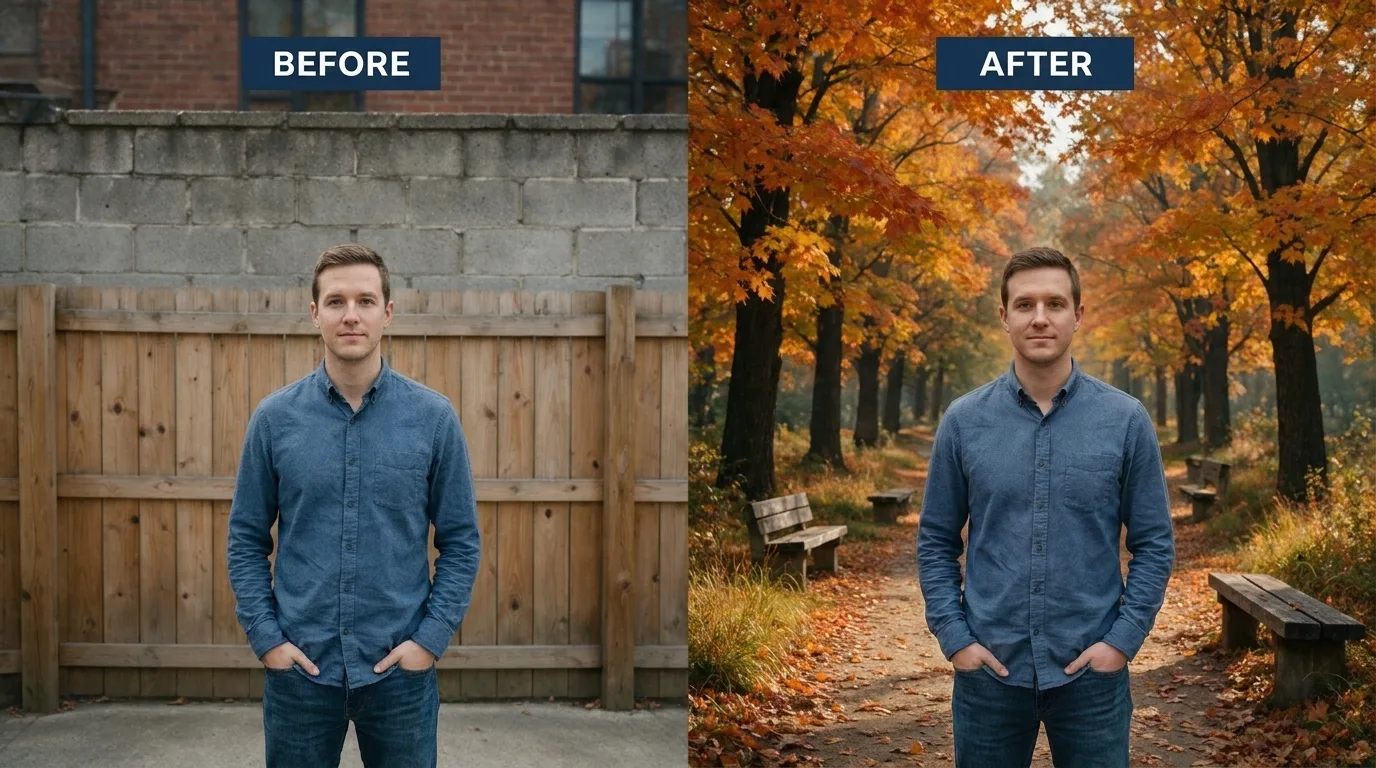
- The 4-Second Test
- The Short Answer
- Two Paths, One Goal
- Path A: The Fast AI Way (Under a Minute)
- Path B: The Photoshop Pro Way (Step by Step)
- The Cutout: Where Every Good Composite Starts
- The Six Realism Factors (Pass the 4-Second Test)
- Pick the Right Background for Where the Image Is Going
- Six Mistakes That Make a Background Swap Look Fake
- When One Image Becomes Five Hundred
- Final Checklist Before You Export
- Frequently Asked Questions
- Final Thought
The 4-Second Test
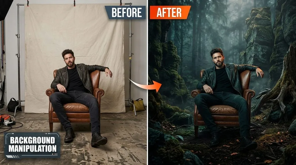
Here’s the thing nobody tells you: anyone can drag a new background behind a cutout in about thirty seconds. The hard part is the four-second test. You show someone the final image. If they notice the edit in the first four seconds — if something feels off even though they can’t name it — you failed. If they just see a photo, you won.
Adding a background to an image is two jobs. First, you separate the subject from its original environment cleanly. Second, you make that subject look like it was photographed in the new scene — same light, same perspective, same shadows, same lens feel. Skip the second job and you get that unmistakable “pasted on” look that customers and viewers subconsciously reject.
This guide walks you through both paths — the fast AI way and the pro Photoshop way — plus the six realism factors that pass the four-second test every time, and the mistakes that fail it.
The Short Answer
Pick your path based on the image and where it’s going. For a simple product on a white background or a quick social post, an AI tool does the whole job in under a minute. For a portrait with hair, a glass product, or anything going to print or high-end advertising, Photoshop with a hand-cleaned layer mask is still the benchmark. Either way, the realism formula is the same: clean cutout + matched perspective + matched light + real shadows + slightly softer background. That’s it. Everything else is polish.
Two Paths, One Goal
Before you open anything, decide which path fits. There is no “best” — there’s only what’s right for this image.
| AI Tool Path | Photoshop Path | |
|---|---|---|
| Time per image | 30–90 seconds | 5–15 minutes |
| Best for | Products on white, simple subjects, social drafts, concept tests | Hair, fur, glass, print, high-end composites, anything where edges matter |
| Control | Limited — you get what the AI gives you, then tweak | Total — every pixel is yours |
| Cost | Free tiers + credit packs | Subscription + learning curve |
| Realism ceiling | Good — AI matches light and shadow automatically | Excellent — you match light and shadow by hand |
Most professionals use both. AI does the cutout and first background pass, Photoshop cleans the edges and finishes. That hybrid workflow is where you get speed and quality.
Path A: The Fast AI Way (Under a Minute)
In 2026, AI background tools detect your subject, cut it out, and generate or place a new scene behind it — often matching light and perspective automatically. You type what you want (“white studio backdrop,” “sunlit wooden table,” “minimalist marble shelf”) and it builds it around the subject. A solid AI background generator like Adobe Firefly is commercially safe and plugs straight into Photoshop via Generative Fill.
| Tool | Best For | Free Tier | Standout Feature |
|---|---|---|---|
| Adobe Firefly / Generative Fill | Pro quality, commercial use | Limited credits | Type any scene; generates inside Photoshop |
| PhotoRoom | Ecommerce product photos | Limited (watermark) | Studio backgrounds, batch processing |
| Canva Magic Replace | Design + background swap | Basic features | Huge template library, team tools |
| ClipDrop (Stability AI) | Quick one-click swaps | Free plan | Fast, clean, runs in browser |
| remove.bg | Pure cutout (no scene) | Free low-res | Fastest cutout; you add the background |
A recent AI background changer comparison tested ten tools and found the results vary a lot on hair and fine edges. The rule that holds across every tool: use AI for the first 90%, then zoom to 100% and clean the edges by hand. That last 10% is what turns a “good AI edit” into a “professional photo.”
Want to test our quality before committing to a large order?
Try our Image Background Removal Services risk-free with a free trial.

Path B: The Photoshop Pro Way (Step by Step)
This is the classic workflow, and once you’ve done it three or four times it takes about five minutes per image. A solid Photoshop background tutorial from Adobe walks through the same steps with video, but here’s the plain-English version.
- Open your image, unlock the layer. Click the padlock on the Background layer in the Layers panel so it becomes editable.
- Select the subject. Choose Select → Subject. Photoshop AI outlines the main object. Clean up with Quick Selection — hold Alt/Option to subtract from the selection.
- Refine the edges. Click Select and Mask. Set View Mode to On Black or On White at 100% opacity — halos jump out immediately. Use Refine Edge Brush only on hair and fur. Set Smooth to 1–3, Feather to 0.2–0.8, Shift Edge to −5% to −15% if a color fringe remains. Check Decontaminate Colors at 40–70%. Output to Layer Mask.
- Place the new background. File → Place Embedded, pick your background, and drag that layer below your subject layer. If the background sits on top, it covers your subject entirely — this is the single most common beginner mistake.
- Resize and position. Ctrl/Cmd+T for Free Transform. Scale the background to fill the canvas. If it’s low-resolution and goes soft, get a bigger source file — stretching never works. If the background file is oversized, you can downscale an image first to keep the PSD file size manageable.
- Match perspective. Check the horizon. Eye-level subject needs an eye-level background horizon. Top-down product needs a top-down or flat-lay background. Use Edit → Transform → Distort on the background (never the product) until the vanishing lines agree.
- Match color and light. Add a Curves adjustment layer, Alt/Option-click between it and the subject to clip it. Match the black and white points to the background. Add a clipped Photo Filter to pull in the background’s color cast. Pro trick: duplicate the background, move it above the subject, Filter → Blur → Average, set to Soft Light at low opacity, clip to subject. It pulls the exact ambient colors of the scene onto your subject.
- Add shadows. Don’t skip — covered next.
- Soften the background. 2–5 pixel Gaussian Blur (Smart Object first) makes the subject pop like a real lens.
- Unify the image. A Color Lookup or Gradient Map at the top of the stack, opacity 15–25%, ties subject and background into one photo instead of two pasted pieces.
The Cutout: Where Every Good Composite Starts
You can’t build a believable scene on a messy cutout. A ragged edge, a leftover fringe of the old background color, or a missing strand of hair becomes very obvious the second you drop a new background behind it. Editors pick the cutout tool based on what the subject’s edges look like — not based on what’s fastest.
- Hard edges (watches, boxes, bottles, furniture, cars): vector clipping path with the Pen Tool. Clean anchor points, sharp straight edges, no blur.
- Soft or detailed edges (hair, fur, lace, sheer fabric, glass): image masking. A path would chop off every wisp; masking preserves the semi-transparent detail that makes a portrait look human.
If you’re unsure which fits your image, understanding clipping path vs image masking saves hours of using the wrong tool. And if hair or fur is making you want to throw your mouse, you’re not alone — those edges are where automated tools fail most often.
Struggling with complex hair or fur edges?
Let our experts deliver flawless, natural cutouts with our advanced Image Masking Service
The Six Realism Factors (Pass the 4-Second Test)
A clean cutout and correct layer order get you a composite. These six things get you a believable one. Work through them in order.
1. Perspective and horizon. If your subject was shot at eye level, the background horizon should sit at eye level. If it was shot top-down, pick or warp a flat-lay background. Flip the background horizontally (Edit → Transform → Flip Horizontal) if its light source disagrees with your subject’s highlights.
2. Light direction. Look at the catchlights in eyes or the highlights on glossy surfaces. They tell you exactly where the light was. Your background’s shadows must fall in the opposite direction. Subject lit from upper left → background shadows fall lower right. Get this backwards and the brain instantly rejects the image.
3. Color temperature. A product shot under cool studio lighting dropped into a warm sunset scene looks alien. Always grade the subject toward the background — never the reverse. Match the black point, the white point, then the overall cast.
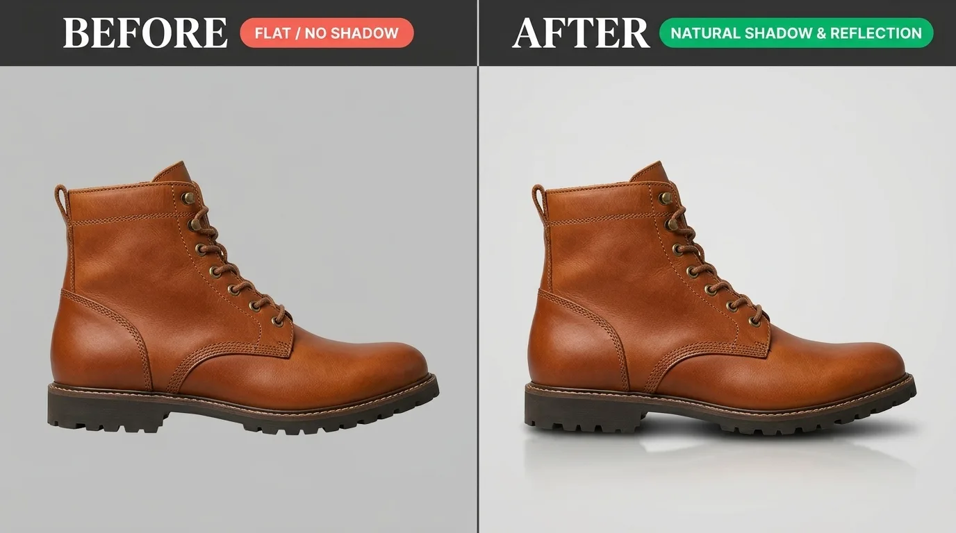
4. Shadows — the most skipped step. Real objects cast shadows. Without them, your subject floats. You need two: a contact shadow (the tight dark sliver right where the object touches the surface) and a cast shadow (the softer, broader one stretching away from the light). New layer below the subject, Multiply blend mode, soft brush at 30% opacity, paint the contact shadow with a dark color sampled from the scene (never pure black). Second layer below that, paint the broader cast shadow, Gaussian Blur 4–8px, opacity 40–70%. Good shadow creation is what makes a product sit on a surface instead of hover above it.
Want to see how a simple shadow can transform an image?
Request a free sample of our Shadow Creation Service today.
5. Background blur. Real photos shot with a real lens have a slightly softer background than the subject. How much depends on the shot:
| Shot Type | Gaussian Blur Radius |
|---|---|
| Close-up portrait (85mm) | 12–24 pixels |
| Half-body portrait (50mm) | 6–14 pixels |
| Full-body / wide scene | 2–6 pixels |
| Product on solid color | 0–4 pixels (or none) |
6. Reflections and a global grade. For glass, polished metal, or a glossy product on a shiny table, duplicate the subject, flip it vertically, fade with a gradient mask, and blur slightly. Then a light Color Lookup layer at 15–25% opacity over the whole image ties everything into one exposure.
Pick the Right Background for Where the Image Is Going
Not every background fits every use. Match the backdrop to the destination.
| Use Case | Background Type | Why |
|---|---|---|
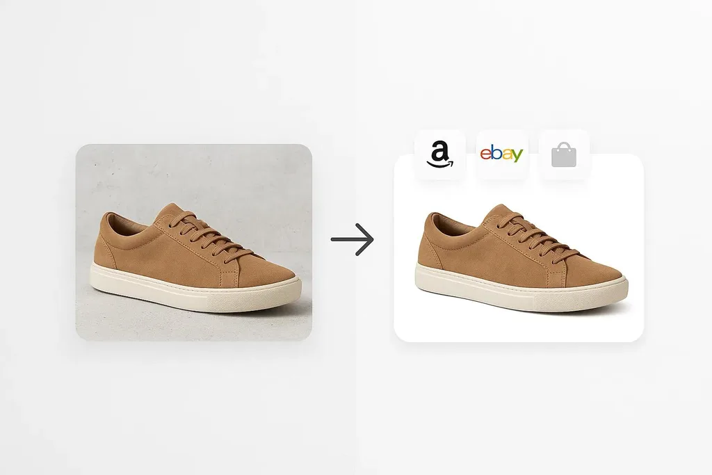
| Amazon / marketplace hero shot | Pure white (RGB 255,255,255) | Platform requirement; product fills 85% of frame |
| Shopify / brand store secondary images | Lifestyle scene or soft gradient | Shows context, boosts conversion |
| Social media / ads | AI-generated or styled scene | Stops the scroll, tells a story |
| Portrait / headshot | Solid color, studio gradient, or blurred environment | Keeps focus on the face |
| Print / catalog | High-res photo, matched carefully | Print reveals every composite flaw |
For ecommerce, the hero shot is non-negotiable — pure white, no props, no text. But the additional images? Those are where lifestyle backgrounds earn their keep, because customers can picture the product in their own space. Consistent product photo editing across your whole catalog matters more than any single image — inconsistent editing is a known trust-killer for online buyers.
Need your images to be marketplace-ready (Amazon, Shopify, etc.)?
Ensure compliance and quality with our professional Photo Retouching
Six Mistakes That Make a Background Swap Look Fake
| Mistake | What You See | Fix |
|---|---|---|
| Halo effect | Thin white/glowing line around subject | Shift mask edge inward 1–2px; Decontaminate Colors |
| Mismatched lighting | Subject lit left, shadows fall right | Flip background horizontally |
| No shadow | Subject looks like it’s floating | Add contact shadow at minimum |
| Wrong perspective | Horizon lines fight each other | Match camera angle; warp background |
| Busy background | Product gets lost in the scene | Simplify; blur or darken background |
| Color profile mismatch | PSD looks great, exported JPG looks washed | Convert to sRGB before export |
When One Image Becomes Five Hundred
Changing a background on one image is a fine afternoon project. Doing it for 500 products in a catalog is a full-time job, and the time cost adds up fast. Once you’re editing more than a few dozen images a month, the math usually flips: paying a professional service per image costs less than the hours you’d spend doing it yourself, and the consistency is better because specialists do it every day.
Typical photo editing cost for background replacement starts under a dollar per image for simple product cutouts on white, and runs to several dollars for complex composites with shadows and lifestyle scenes. If you want to compare freelance and agency rates across the industry, these photo retouching prices break it down by service type. The tell that you’re ready to hand it off: you start dreading the edit more than the shoot. When that happens, it’s time to outsource photo editing and get your evenings back.
Ready to transform your raw photos into professional assets?
Get a custom, no-obligation quote tailored to your specific volume and needs. Explore Clipping Expert Asia
Final Checklist Before You Export
Run through this every time. It takes thirty seconds and catches 90% of the problems.
- Edges on a solid color. Drop a temporary bright red or green fill layer under the subject. Holes, fringe, and stray pixels jump out. Delete it when done.
- Zoom to 100%. Preview lies. Full size tells the truth.
- Shadow present? Even on white backgrounds, a soft contact shadow grounds the product.
- Light direction matches? Flip the background if it doesn’t.
- sRGB on export. JPG high quality for web; PNG if you need a transparent background for design work; TIFF/PSD for print.
- Save the PSD. Always. Flatten only at export. If the client wants a different background next week, you’ll thank yourself.
Frequently Asked Questions
How do I add a background to an image for free?
Use a free browser tool like remove.bg to cut out the subject, download the transparent PNG, then drop it onto any background in Canva, Pixlr, or Photopea. For AI-generated scenes, Adobe Firefly and ClipDrop both offer free credit tiers.
What’s the easiest way to add a white background to a product photo?
Remove the original background (one-click Remove Background in Photoshop, or remove.bg online), create a Solid Color Fill layer set to pure white (RGB 255,255,255), place it beneath your subject, and add a soft contact shadow so the product doesn’t float. Export as JPG.
How do I make a replaced background look realistic?
Six things: match perspective and horizon, match light direction, match color temperature, add a contact shadow plus a softer cast shadow, apply slight Gaussian blur to the background, and add a light global color grade over the whole image. Skip any one and it looks pasted on.
Can I add a background to a photo on my phone?
Yes. Picsart, PhotoRoom, Pixelcut, and Snapseed all remove backgrounds and add new ones right on your phone. Simple subjects come out great; complex hair still benefits from desktop editing.
Why does my subject have a white outline after adding a new background?
That’s a halo — the cutout wasn’t tight enough, or a fringe of the old light background remained. Fix it by shifting the layer mask edge inward 1–2 pixels (Select and Mask → Shift Edge, negative value) or checking Decontaminate Colors.
Do I need Photoshop, or can AI tools do the whole job?
For simple product shots on solid backgrounds, AI tools handle the whole job in seconds. For hair, glass, tricky lighting, or anything going to print, Photoshop still gives you the control you need. Most pros use both — AI for the cutout, Photoshop for finishing.
How much does professional background replacement cost?
Simple product background on white starts under $1 per image at volume. Complex composites with realistic shadows, reflections, and lifestyle scenes run $3–$10 per image. Batch discounts at 500+ images bring the per-image cost down significantly.
Final Thought
The drag-and-drop part is easy. The skill is in the invisible details — the shadow that’s just dark enough, the color cast that matches without being obvious, the background blur that mimics a real lens. Nobody looks at a great composite and thinks “nice background swap.” They just think it’s a good photo. That’s the whole goal. Start with a clean cutout, respect the light, never skip the shadow, and your composites will pass the four-second test every single time.