


The Best Way to Organize Photos (Without Losing Your Mind)
November 14, 2026
How to Fix a Corrupted SD Card (and Recover Every File) in 2026 — Complete Step-by-Step Guide
November 17, 2026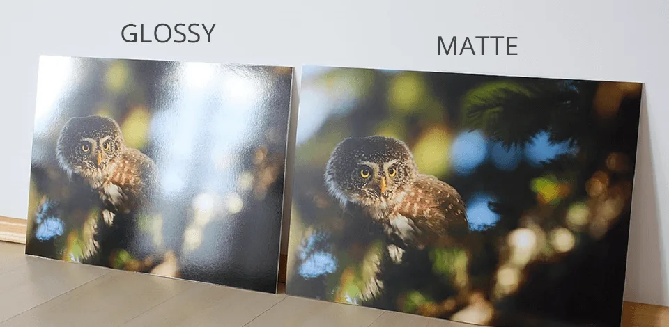
TL;DR: Pick glossy when you hold the print in your hand — albums, vibrant landscapes, product shots — because it delivers the deepest blacks, richest color, and crispest detail. Pick matte when the print lives on a wall, behind glass, or in bright light, because it kills glare, hides fingerprints, and reads well from any angle. When you can’t decide, order luster (satin/pearl) — it keeps ~60% of glossy’s color punch while cutting most of the glare, and most professional photographers default to it.
- The one thing nobody tells you: finish is physics, not quality
- Glossy photo finish: when shine works for you
- Matte photo finish: the quiet professional's choice
- Matte vs glossy at a glance
- The middle ground you probably want: luster, satin, pearl, and friends
- By use case: the decision you actually face
- Does finish change the price? Usually no — but size does
- Longevity: the finish question hides a paper question
- Five mistakes that ruin a print regardless of finish
- So: matte or glossy? Your 30-second decision tree
- Frequently Asked Questions
The one thing nobody tells you: finish is physics, not quality
Here’s the dirty secret of the photo-print world. A glossy and a matte print of the exact same file use the same paper base, the same ink or silver-halide emulsion, and the same printer. The only difference is the top coating — and that coating changes how light bounces off the surface.
Glossy coating is smooth and sealed. Light hits it and reflects back at one clean angle — what physicists call specular reflection. That mirror-like bounce keeps stray light off the dark areas, so blacks stay deep and colors read as saturated. It also makes every lamp, window, and fingerprint visible.
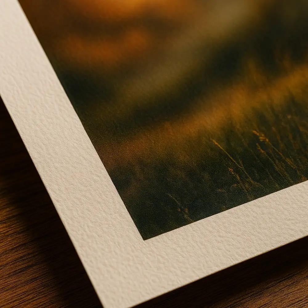
Matte coating is micro-textured and porous. Light hits it and scatters in every direction — diffuse reflection. No single bright reflection forms, so you see the print instead of the room. The trade-off is softer contrast and slightly lighter blacks.
Neither finish is “higher quality.” They’re two tools for two lighting situations. Once you internalize that, every other decision in this guide gets simple.
Glossy photo finish: when shine works for you
Glossy is the default at drugstore labs for a reason — it makes a cheap print look expensive.
What glossy does best:
- Deepest blacks and highest contrast of any standard finish. A night sky or a shadow-heavy portrait gains real drama.
- Maximum color saturation. Sunsets, tropical water, flowers, and food photography pop the way they did on your screen.
- Perceived sharpness. The smooth surface makes fine detail — eyelashes, fabric weave, product text — read as crisper.
- Cheapest option at most labs. Because it’s the default, glossy 4×6 prints often start at $0.10–$0.19 each.

Where glossy fights you:
- Glare. A glossy print facing a window behaves like a mirror. You’ll see your own reflection more than the photo.
- Fingerprints. The smooth coating records every touch. If kids or clients handle the prints, expect smudges.
- Behind glass, it creates double reflections. Glass already reflects light. Put a glossy surface under it and you get two reflective layers stacked. In a bright room the print becomes unreadable from most angles.
- Scratches show. A minor abrasion on glossy looks like a bright white line; on matte it disappears.
Best for glossy: photo albums, scrapbook pages viewed in hand, vibrant landscapes, product/commercial shots, portfolios with controlled lighting, and any print you’ll pass around rather than hang.
Matte photo finish: the quiet professional’s choice
Matte absorbs light instead of bouncing it. That single trait makes it the most forgiving finish you can buy.
What matte does best:
- Zero glare, any angle. Walk past a matte print in a narrow hallway and it looks the same from every step. Stand in front of a glossy one and the image shifts with you.
- Fingerprint resistance. The textured surface hides handling marks almost completely.
- Fine-art feel. Galleries and museums overwhelmingly choose matte or textured cotton-rag papers because the lack of shine forces your eye onto the tones and composition.
- Flattering skin. Matte softens micro-detail — pores, fine lines — which many portrait subjects prefer.
Where matte falls short:
- Colors mute. The same sunset that glows on glossy looks subdued on matte. If your image lives on color impact, matte drains some of it.
- Blacks lift. Matte can’t hold the deepest black point, so high-contrast images lose a little drama.
- Texture can soften fine detail. At very large sizes, the paper tooth becomes visible and text or tiny logos read less sharp.
- Harder to clean. Dust settles into the texture; wiping can push it in deeper.
Best for matte: framed prints behind standard glass, bright rooms with multiple windows, hallways and stairwells, black-and-white fine art, professional headshots, portfolios, and prints that get handled a lot.
Matte vs glossy at a glance
| Factor | Glossy | Matte | Luster/Satin/Pearl |
|---|---|---|---|
| Surface | Smooth, mirror-like | Micro-textured, flat | Fine texture, soft sheen |
| Color saturation | Highest | Softest/muted | High (≈60% of glossy’s lift) |
| Blacks & contrast | Deepest, punchiest | Lightest, gentlest | Near-glossy depth |
| Glare | Severe in bright light | None | Low, controlled |
| Fingerprints | Show easily | Nearly invisible | Minimal |
| Behind glass | Risky (double reflection) | Ideal | Works well |
| Best for | Albums, landscapes, product | Framing, B&W, portraits | Wedding albums, general default |
| Typical 4×6 price | $0.10–$0.19 | $0.15–$0.25 | $0.20–$0.35 |
The middle ground you probably want: luster, satin, pearl, and friends
If you search “glossy vs matte” long enough, every professional photographer eventually says the same thing: I almost never pick either. They pick luster — called satin by some labs, pearl by Fujifilm, and silk by a few premium album companies. It’s the same family of finish, just branded differently.
Luster sits between the two extremes. It keeps most of glossy’s color depth — roughly 60% of the saturation lift, by most lab estimates — while adding a fine texture that breaks up reflections. It shows barely any fingerprints, renders skin tones more accurately than full gloss, and works behind glass without the double-reflection problem.
[IMAGE 5 — place in luster section]
When to step beyond luster:
- Metallic / Fuji Pearl: A pearlized, almost 3D sheen. Stunning for architecture, cars, and bold abstracts; can look cheap on portraits. Very reflective — needs controlled light.
- Deep matte velvet (Fuji Deep Matte): Ultra-flat, velvety, zero reflection. The choice for fine-art nudes, moody portraits, and gallery exhibitions. Colors are intentionally subdued.
- Baryta / fiber-based: A heavy, textured cotton paper with a classic darkroom feel. The premium pick for exhibition black-and-white.
- Canvas: Technically a substrate, not a finish, but it’s inherently matte and glare-free — you hang it with no glass at all.
By use case: the decision you actually face
1. Framing behind glass
Matte wins, almost every time. Standard glass already reflects light; adding a glossy surface under it creates stacked reflections. In Frameology’s testing, matte and luster stay readable from any angle in typical home lighting, while glossy behind standard glass “behaves like a mirror in bright conditions.” If you insist on glossy, upgrade to museum-grade anti-reflective (UV) glass — it cuts the double-reflection problem but adds $30–$100 to the frame.

2. Albums and scrapbooks
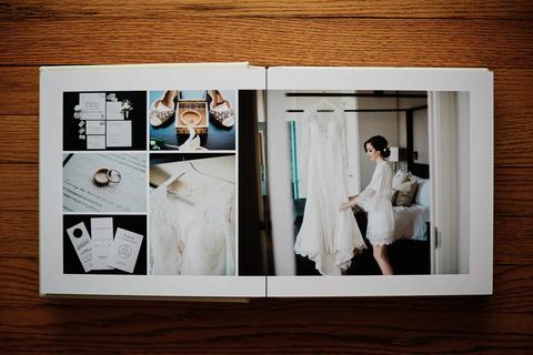
Glossy or luster. You view an album in your hands, under your control, so glare rarely matters — and glossy’s color punch makes every page feel alive. The catch: glossy pages can stick together when pressed, especially in humid climates. Luster solves that and hides the fingerprints from 40 relatives flipping pages at a wedding. That’s why luster dominates premium wedding albums.
3. Portraits and weddings
Luster first, matte second. Professional portrait photographers consistently pick luster because it handles skin tones honestly — glossy can oversaturate cheeks and lips, while matte can flatten a face. For fine-art maternity or newborn sessions where mood beats punch, matte or deep matte velvet wins.
If you’re a wedding photographer shipping hundreds of edited images, your finish choice pairs with your editing pipeline — a consistent portrait retouching style looks different on each surface, so order a test strip before committing a full album.
4. Black and white
This is the one place taste genuinely splits. Glossy gives the deepest blacks and richest tonal separation — classic Ansel Adams darkroom look. Matte (especially cotton-rag or baryta) gives a quieter, gallery-grade feel where the grays breathe. If you print B&W regularly, order one of each in a small size and live with them for a week. Nobody can make that call for your eye.
5. Ecommerce, print-on-demand, and product photos
If you sell prints on Printful, Printify, or a POD storefront, matte is the safer default — it ships better (scratches vanish), photographs better for your own product listings, and returns from “I can’t see it because of glare” drop to near zero. Glossy works only for bold graphic art and posters in controlled lighting. For the product photos of those products (the shots on your Shopify store), clean product photo editing matters more than finish — but matte prints still model better under studio lights.
6. Gifts, cards, and anything people sign
Matte. Ballpoint and gel pens skip on glossy coating; they write cleanly on matte. If you’re making holiday photo cards, graduation announcements, or anything with a handwritten message, matte is the practical choice.
Does finish change the price? Usually no — but size does
At most consumer labs, glossy and matte 4×6 prints cost the same. Luster/satin adds a small premium (often 10–25%), and fine-art cotton-rag papers jump in price entirely. The real cost driver is size, not finish.
| Size | Walmart (glossy) | Shutterfly | Nations Photo Lab (lustre) |
|---|---|---|---|
| 4×6 | ~$0.16 | ~$0.10 (app deal) | ~$0.25 |
| 8×10 | ~$2.94 | ~$3.99 | ~$3.19 |
| 12×18 | ~$10.86 | ~$12–15 | ~$12–16 |
| 20×30 | ~$20.86 | ~$25–30 | ~$28–35 |
Prices sampled November 2026; same-day pickup and lustre/fine-art upgrades vary by location.
Before you print hundreds, check the photo editing cost of your whole pipeline — retouching per image usually dwarfs the finish surcharge.
Longevity: the finish question hides a paper question
Here’s what the glossy-vs-matte debate almost never mentions: the paper base and ink matter more than the coating for how long your print lasts.
- Resin-coated (RC) silver-halide paper (what every drugstore and most online labs use, in both glossy and matte): Fujicolor Crystal Archive, the industry benchmark, rates at roughly 60 years of display before noticeable fading, per Wilhelm Imaging Research. But RC papers have a plastic layer; in fluctuating humidity, delamination is a real long-term risk — one independent test found 31 of 47 RC papers showed delamination after 15 years at 20°C / 40% RH.
- Pigment ink on 100% cotton rag (fine-art matte, always matte or textured): rated at 100–200 years under archival conditions (acid-free mat, UV glass, stable humidity). This is what galleries sell as “archival pigment prints.”
- Dye-based inkjet on plain paper: 20–30 years, sometimes less in sunlight.
Rule of thumb: for a memory you want your grandkids to hold, pay for pigment-on-cotton. For vacation snapshots in an album, RC glossy or matte will outlive the album. If you’re prepping files for that archival print, export in the right color space — sRGB vs Adobe RGB matters more than most people realize — and at a true 300 DPI for printing, not the 72 DPI your phone exports.

Five mistakes that ruin a print regardless of finish
- Letting the lab “auto-correct” your color. If you (or your editor) already graded the image, select “No Color Correction” at checkout. Auto-correction re-interprets your work and produces inconsistent results across prints — the #1 complaint professional photographers have about consumer labs.
- Uploading a low-res file. 300 PPI at final size is the floor. A 2MB phone JPEG blown up to 16×20 looks soft on any finish. Resize without losing quality properly before upload.
- Forgetting soft-proofing. Photoshop and Lightroom can simulate how your file will look on matte vs glossy paper (View → Proof Setup). Five minutes of soft-proofing saves an entire reorder.
- Ordering one finish for every image. High-contrast sunset? Glossy. Moody portrait? Matte. Batch-ordering the same finish for 200 wedding photos is how you end up with 40 prints you dislike.
- Touching the emulsion. Even matte prints mark under pressure. Hold prints by the edges, and interleave album pages with acid-free tissue.
So: matte or glossy? Your 30-second decision tree
- Will it hang on a wall? → Matte (or luster). Done.
- Will it live in an album or your hand? → Glossy for color punch; luster if many hands will touch it.
- Black and white or fine art? → Matte/cotton-rag for gallery mood; glossy for max contrast.
- Portraits or weddings? → Luster, always, unless you’ve tested and prefer matte.
- Still unsure? → Order a 4×6 test print of your favorite image in glossy, matte, and luster ($1.50 total at most labs). Hold them next to the window where you’ll hang the final print. The answer will be obvious.
If you’re sending hundreds of images out for editing before print, a consistent wedding editing workflow or a trusted partner to outsource photo editing will do more for final print quality than any finish choice — a poorly edited image looks bad on every paper.
Frequently Asked Questions
Is glossy or matte better for photos?
Neither is universally better. Glossy gives richer color, deeper blacks, and sharper detail but glares and fingerprints. Matte is glare-free, fingerprint-resistant, and ideal for framing. Choose by where and how the print will be viewed.
Should I get glossy or matte for framing?
Matte (or luster). Behind standard glass, glossy creates a second reflective layer that makes the print hard to see in bright rooms. If you want glossy, upgrade to anti-reflective museum glass.
Do matte or glossy prints last longer?
The finish coating barely affects longevity. What matters is the paper base and ink: RC silver-halide prints (glossy or matte) rate around 60 years; pigment ink on cotton rag (always matte/textured) rates 100–200 years under archival conditions.
Is luster the same as satin or pearl?
Yes — luster, satin, pearl, and silk are different brand names for the same family of semi-gloss, lightly textured finishes. They sit between glossy and matte and are the default choice of most professional photographers.
Why do professional photographers use matte or lustre instead of glossy?
Lustre and matte resist fingerprints, avoid glare under mixed lighting, render skin tones more accurately, and work behind glass. Glossy’s strengths (color punch, deep blacks) only show in controlled light, which client homes rarely have.
Does glossy or matte show fingerprints more?
Glossy, dramatically. The smooth reflective coating makes every oil mark visible. Matte’s texture hides fingerprints almost completely; luster hides most.
Can I mix glossy and matte prints in one gallery wall?
You can, but it usually looks inconsistent — the sheen difference reads as a mistake. Pick one finish family for a wall; vary frame styles instead.