

Best Outdoor Home Security Cameras in 2026: The Complete Buyer’s Guide
June 5, 2026
Depth of Field Explained: Tips Every Photographer Needs
June 6, 2026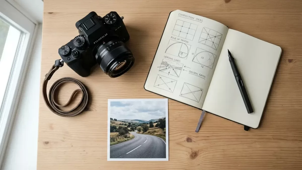
Every time you lift a camera to your eye, you make choices. You decide what to include, what to exclude, and where to place the elements inside your frame. This intentional arrangement is not a minor mechanical step. It is the defining language of visual storytelling.
When people look at an image, they respond instantly to its structure. A chaotic scene leaves viewers confused, while a thoughtfully arranged shot guides their eyes naturally across the canvas. Understanding how to structure your image separates simple snapshots from compelling visual art. This comprehensive guide will teach you how to master the art and science of photographic composition, helping you transform everyday scenes into impactful stories.
Ready to transform your shots? Explore our comprehensive professional image editing services to make your compositions truly stand out today.
- Decoding the Core Definition of Photographic Composition
- The Structural Blocks: Building Elements of Composition
- Classical Guidelines: Rules to Ground Your Vision
- Advanced Composition Techniques to Elevate Your Images
- Composition across Different Photography Genres
- Mindset Shifts: Moving from Rules to Creative Intuition
- Frequently Asked Questions (FAQs)
Decoding the Core Definition of Photographic Composition
Understanding the Visual Blueprint
Composition means the arrangement of visual elements within a photographic frame. The word originates from the Latin compositio, which means “putting together.” In photography, you do not merely capture a subject; you arrange shapes, lines, colors, textures, and light to build a cohesive visual experience.
Think of composition as the organizational blueprint of your photograph. While a painter starts with a blank canvas and adds elements, a photographer starts with the entire world and subtracts chaos. You isolate a piece of reality and organize it inside a rectangular box to communicate a specific mood, idea, or feeling.
Why Composition Outperforms Your Equipment
Many beginners believe that buying a more expensive camera will automatically improve their photography. This is a common misconception. A high-end sensor can capture incredible detail, sharp pixels, and wide dynamic range, but it cannot decide where to place the subject.
Great composition can save an image shot on a basic smartphone, while poor composition will ruin a photo taken with a high-end camera. The arrangement of elements controls how the viewer feels. It creates tension, stability, energy, or calm. When you prioritize structure over gear, you unlock the ability to capture unforgettable photographs anywhere.
The Structural Blocks: Building Elements of Composition
Lines and Their Hidden Psychology
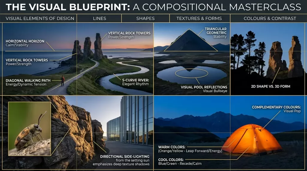
Lines form the framework of almost every photograph. They act as pathways for the eyes, pulling the viewer into the frame and directing them toward the primary subject. Different types of lines evoke distinct psychological responses:
- Horizontal Lines: These lines convey a sense of calm, stability, and rest. Think of a quiet ocean horizon or a sleeping person.
- Vertical Lines: These lines communicate power, growth, height, and strength. Consider towering skyscrapers, massive redwood trees, or upright human postures.
- Diagonal Lines: These lines introduce energy, movement, and dynamic tension. They break the static feel of a frame and suggest action or speed.
- Curved Lines: Also known as S-curves, these lines create a gentle, organic, and elegant rhythm. They mimic the natural flow of rivers, paths, and human bodies.
Shapes and Forms
Shapes are two-dimensional structures defined by outlines or boundaries, such as a silhouette against a bright sky. Forms are three-dimensional structures that possess depth, volume, and weight, typically revealed by the interplay of light and shadow.
When you recognize geometric shapes (triangles, circles, rectangles) or organic shapes (leaves, clouds) in your environment, you can use them to anchor your image. Triangles offer excellent stability and strength, while circles naturally draw attention into their center, acting as visual bullseyes.
Texture and Detail
Texture appeals to the viewer’s sense of touch. The rough bark of an old tree, the sleek glass of a modern skyscraper, or the soft ripples of water add tactile reality to a flat print or screen.
You can emphasize texture by utilizing directional, side-lit lighting, which casts small shadows across the surface. Highlighting these details adds a physical presence to your work, pulling the viewer closer to the scene.
Color and Contrast
Color is a powerful tool for emotional communication. Warm colors like red, orange, and yellow leap forward and create a feeling of energy or intimacy. Cool colors like blue and green recede into the background, evoking a sense of calm or isolation.
Contrast does not apply only to dark and light values; it applies to colors as well. Utilizing complementary colors—such as placing a bright orange tent against a deep blue twilight mountain—creates an instant visual pop that naturally locks in the viewer’s attention. To understand how artists have used these principles for centuries, explore the history of composition in the visual arts to see how design fundamentals transcend time.
Space: Positive versus Negative
Every photograph contains two types of space:
- Positive Space: This area contains the actual subjects, such as a person, a boat, or a building.
- Negative Space: This is the empty or minimalist area surrounding the subject, like a clear sky, a blank wall, or an open desert.
Using heavy negative space isolates your subject, giving it room to breathe. It emphasizes loneliness, scale, or minimalism. Conversely, filling the frame entirely with positive space creates energy, density, and sometimes a sense of overwhelm.
Want flawless product compositions? Try our precise background removal service to eliminate distractions and keep all focus on your subject.
Classical Guidelines: Rules to Ground Your Vision
The Rule of Thirds

The Rule of Thirds remains the most popular compositional guideline in photography. To apply it, imagine dividing your frame into nine equal rectangles using two horizontal lines and two vertical lines.
Instead of placing your subject dead center, position it along these grid lines or at the four intersection points. Placing a subject off-center creates a more balanced, dynamic, and natural interaction between the subject and its surroundings. When shooting landscapes, place the horizon line on the top third line to emphasize the foreground, or on the bottom third line to highlight a dramatic sky.
The Golden Ratio and the Fibonacci Spiral
For a more sophisticated balance, look to the Golden Ratio, a mathematical ratio of 1:1.618 that appears consistently throughout nature, architecture, and classical art. In photography, you can apply this via the Phi Grid or the Fibonacci Spiral.
The Fibonacci Spiral concentrates tight details in one corner and sweeps outward in a organic curve across the rest of the frame. This layout guides the eye on a fluid journey through the image. It offers a more subtle, elegant placement than the rigid Rule of Thirds, making it ideal for environmental portraits and sweeping landscapes.
The Golden Triangle
The Golden Triangle works beautifully for scenes filled with diagonal lines and dynamic action. Divide your frame with a diagonal line running from one corner to the opposite corner. Then, draw two smaller lines from the remaining corners so they intersect the main line at 90-degree angles.
This grid divides the canvas into a series of triangles. By aligning your subjects, horizons, or lines with these triangular boundaries, you create an active layout that keeps the eye moving through the frame.
The Rule of Odds
The Rule of Odds states that an odd number of subjects is visually more appealing than an even number. When a photo contains two or four items, the human brain naturally pairs them up, creating symmetry but also a sense of completion that can feel static.
An odd number of subjects (like three or five trees, people, or flowers) prevents the brain from pairing them up. This layout forces the eyes to look from one object to another, creating a natural visual rhythm that keeps the viewer engaged longer.
Advanced Composition Techniques to Elevate Your Images
Leading Lines and Paths
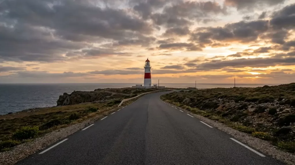
A leading line is a visual path that leads directly to your main subject. A road winding through hills, a railway track disappearing into the distance, or a simple handrail can serve as a leading line.
To make this technique effective, ensure the line actually points toward something important. A line that wanders off the edge of the frame without hitting a subject will frustrate the viewer. Use these paths to build an intentional narrative journey into your frame.
Frame Within a Frame
A frame within a frame involves using an element inside your scene to border your main subject. This technique adds depth, context, and structural layers to your work.
- Architectural Frames: Doorways, windows, stone arches, and bridges.
- Natural Frames: Overhanging tree branches, cave mouths, or rock crevices.
- Transient Frames: Light beams, shadows, or even reflections in rear-view mirrors.
This technique isolates your subject and blocks out distracting elements around the edges of the frame, instantly drawing the viewer’s eye exactly where you want it.
Symmetry and Patterns
While off-center compositions look incredible, perfect symmetry can create breathtaking, high-impact imagery. Centering a perfectly symmetrical building, reflection, or road creates balance, order, and a sense of calm.
Patterns appear when visual elements like shapes, lines, or colors repeat themselves. The human brain loves patterns because they offer order. You can create a powerful compositional statement by capturing a pattern and then intentionally breaking it with your main subject. For instance, imagine a large grid of identical blue windows with one single window painted bright red.
Juxtaposition and Conceptual Contrast
Juxtaposition happens when you place two contrasting elements close together within the same frame. This contrast forces the viewer to compare them, generating a deep conceptual story.
You can contrast literal elements, like a tiny bird sitting on a massive concrete statue, or abstract ideas, such as an elderly person sitting beneath a billboard of a young model. Juxtaposition moves your work beyond simple visual beauty and into the realm of intellectual storytelling.
Foreground, Midground, Background: Creating Depth
Because photos are displayed on two-dimensional screens or papers, you must work deliberately to imply three-dimensional depth. You can achieve this by dividing your scene into three distinct layers:
- Foreground: Elements closest to the lens, like rocks, wildflowers, or puddles.
- Midground: Your primary subject, such as a cabin, a person, or a boat.
- Background: Remote elements that provide context, like distant mountains, trees, or skies.
Including a strong foreground element gives the viewer a physical entry point into the frame. It establishes a sense of scale, making them feel as if they are standing right inside the landscape.
Elevate your portraits with flawless composition. Use our expert photo retouching solutions to enhance every detail cleanly and professionally.
Composition across Different Photography Genres
Landscape Composition

Landscape photography requires patience and careful planning. Instead of standing at eye level and pointing your lens forward, drop down low to the ground to include interesting foreground textures. Use wide-angle lenses to stretch the distance between your foreground and background layers.
Always check your horizon line before pressing the shutter button. A crooked horizon can ruin a landscape photo. Keep your edges clean and ensure that stray tree branches or power lines do not cut into the frame awkwardly.
Portrait Composition
In portraiture, the eyes are your primary focal point. Place the subject’s dominant eye on an intersection point of the Rule of Thirds grid to build an instant connection with the viewer.
Pay close attention to headroom—the space between the top of the subject’s head and the upper edge of the frame. Too much headroom makes the subject look like they are sinking, while too little cuts off their hair awkwardly. Be mindful of cropping points as well; never crop a person directly at their natural joints (knees, elbows, ankles, or wrists), as this creates an illusion of missing limbs. Crop across mid-thigh, the waist, or the upper chest instead.
       [ Correct Crop Points ]
   ─── Upper Chest / Shoulders ───
   ─── Mid-Thigh ──────────────────

       [ Avoid Cropping Here ]
   ─── Elbows / Wrists ────────────
   ─── Knees / Ankles ─────────────
Street and Action Photography
Street and action photography require fast reflexes and sharp anticipation. To nail your compositions on the fly, you must pick your background first, arrange your frame, and wait for the action to step into your composition. This approach is known as the “trap method.”
When documenting moving targets, leave plenty of active space ahead of them. If a athlete is running from left to right, place them on the left side of the frame so they have space to move into. If you crop too tightly in front of them, they will look like they are about to crash into the edge of the frame. To capture these fleeting moments perfectly, check out this guide on the best cameras for action and sports photography in 2026 to ensure your camera system can keep pace with your creative vision.
Commercial and Product Photography
Commercial composition focuses entirely on clarity and branding. The viewer must identify the product instantly without distractions. This genre relies heavily on clean lines, balanced symmetry, and careful color coordination.
You must eliminate busy environments entirely to maintain a premium look. Utilizing a shallow depth of field helps blur out the background, making your product pop forward off the screen.
Mindset Shifts: Moving from Rules to Creative Intuition
The Art of Subtraction

Many photographers try to pack too many ideas into a single photograph. They include a beautiful tree, a dramatic cloud, an interesting path, and a person all at once. This dilutes the impact of the final image.
Before you take a shot, ask yourself: What is the exact subject of this photo? If an element does not support or elevate that main subject, remove it. Move closer, adjust your angle, or zoom in to crop out the noise. Simplicity is often the key to powerful compositions.
Breaking the Rules Intentionally
The “rules” of composition are not absolute laws. They are guidelines based on how humans naturally process visual information. Once you understand how these guidelines work, you can break them intentionally to create specific emotional responses.
For example, placing a subject at the very edge of a frame can evoke feelings of isolation, escape, or anxiety. Shooting from a chaotic, tilted angle (known as a Dutch angle) can create a sense of unease or disorientation. Break the rules with purpose, not out of carelessness. For more inspiration on how to adapt your workflow and explore advanced composition guidelines, review Adobe’s breakdown of photographic composition to expand your creative approach.
Analyzing Your Work Post-Capture
To train your eye, you must study your own images critically. When reviewing your catalog, look closely at your successful shots and ask yourself why they work. Look at your failed images and identify where the composition fell apart.
You can also use the crop tool in your editing software to experiment with different compositions after the fact. Changing a horizontal shot into a tight vertical crop can completely alter its story, helping you learn how to frame scenes more effectively on future shoots.
Perfect your image composition from start to finish. Contact us for top-tier clipping path services that give you absolute creative control.
Frequently Asked Questions (FAQs)
What is the single most important rule of composition?
There is no single “most important” rule, but the Rule of Thirds is the best starting point for beginners. It provides a simple, reliable framework for shifting your subject away from the dead center of the frame, instantly creating more balanced and engaging images.
Can bad composition be fixed in post-processing?
You can make minor adjustments to your composition during post-processing by cropping, rotating, or removing small distractions with cloning tools. However, you cannot fix fundamental issues like poor camera angles, missing foreground elements, or bad perspective choices. It is always best to get the composition right in the camera.
How does camera focal length affect photo composition?
Focal length alters your visual perspective. Wide-angle lenses (like 24mm) stretch out distances, making foreground objects look large and background elements look small. Telephoto lenses (like 200mm) compress space, pulling the background closer to your subject and making elements appear tightly layered.
What is negative space, and why should I use it?
Negative space is the empty area that surrounds your main subject, such as a plain sky, flat water, or a blank wall. Using heavy negative space removes busy distractions, draws immediate attention to your subject, and gives your photograph a clean, modern, and minimalist feel.
Why do my centered photos look boring?
Placing your subject dead center often creates a static, predictable look. Because the human brain processes centered items quickly, the viewer’s eye tends to lock onto the middle and ignore the rest of the frame. Off-centering your subject forces the eye to travel across the entire image, making the viewing experience more engaging.
How can I practice composition without a camera?
You can practice composition anytime by using your eyes or a smartphone. Look around your current environment and identify leading lines, geometric shapes, framing opportunities, or interesting patterns. Training your brain to spot these elements throughout the day will make composition second nature when you hold your camera.