
How Big Is an 8×10 Photo? Your Ultimate Guide to Dimensions, Uses, and More
February 26, 2026
32GB Memory Card Photo Capacity (JPEG vs RAW Explained)
February 28, 2026
Photographers and designers often face challenges when colors in an image clash or appear inconsistent. You unify colors in Photoshop to create a cohesive look that draws viewers in. This process involves adjusting hues, saturations, and brightness levels across the entire photo or specific elements. Professionals use these techniques to enhance product shots, portraits, and landscapes. By mastering color unification, you elevate your editing skills and produce visually appealing results. Whether you work on personal projects or client deliverables, understanding this method saves time and boosts creativity.
Color unification streamlines your workflow in graphic design and photography. You start by analyzing the image’s color palette. Tools like the eyedropper help identify dominant shades. From there, adjustment layers allow precise control over color shifts. Beginners appreciate how Photoshop’s interface simplifies complex edits. Experienced users layer multiple adjustments for nuanced outcomes. This guide walks you through each step, ensuring you apply changes effectively.
- Understanding Color Unification Basics
- Preparing Your Image for Editing
- Using Adjustment Layers for Color Harmony
- Targeting Specific Colors with Selective Tools
- Advanced Techniques with Blending Modes
- Correcting Color Casts Effectively
- Harmonizing Colors Across Multiple Images
- Tips for Efficient Color Unification
- Common Mistakes to Avoid
- Integrating Unification into Your Workflow
- Exploring Creative Applications
- Troubleshooting Persistent Issues
- Conclusion
- Frequently Asked Questions (FAQs)
Understanding Color Unification Basics
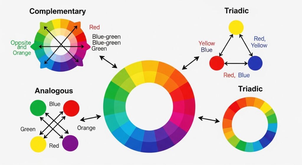
You begin color unification by grasping its core principles. Colors in an image interact based on harmony theories, such as complementary or analogous schemes. Photoshop enables you to align mismatched tones, like correcting a blue sky that clashes with warm foreground elements. Designers rely on this to maintain brand consistency in visuals.
Examine your image first. Open it in Photoshop and zoom in to spot discrepancies. Uneven lighting often causes color variations. You correct these by targeting specific channels in the RGB or CMYK modes. Switch to Lab color mode for advanced separation of lightness from color data. This approach prevents muddy results.
Practice on sample images to build confidence. Select photos with varied lighting conditions. Experiment with the histogram to visualize color distribution. Balanced histograms show even spreads across channels. You adjust curves to flatten peaks and fill valleys, promoting unity.
Incorporate keyboard shortcuts for efficiency. Press Ctrl+M for curves or Ctrl+U for hue/saturation. These tools form the foundation of unification. Layer masks refine your edits, protecting areas you want unchanged.
Preparing Your Image for Editing
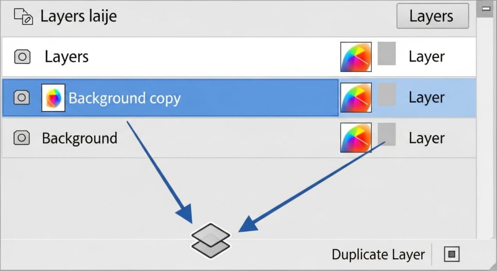
You prepare your image by duplicating the background layer. This preserves the original while you work on a copy. Right-click the layer and choose “Duplicate Layer.” Name it clearly, like “Color Edit Base.”
Clean up distractions next. Remove dust spots or minor blemishes with the spot healing brush. A clean canvas ensures color adjustments apply evenly. Set the brush hardness to 0% for soft blends.
Calibrate your monitor for accurate color representation. Use Photoshop’s color settings under Edit > Color Settings. Select Adobe RGB for wider gamut if printing, or sRGB for web use. Consistent profiles prevent surprises in final outputs.
Organize your workspace. Dock essential panels like Layers, Channels, and Adjustments. Customize via Window > Workspace. A tidy setup speeds up your process.
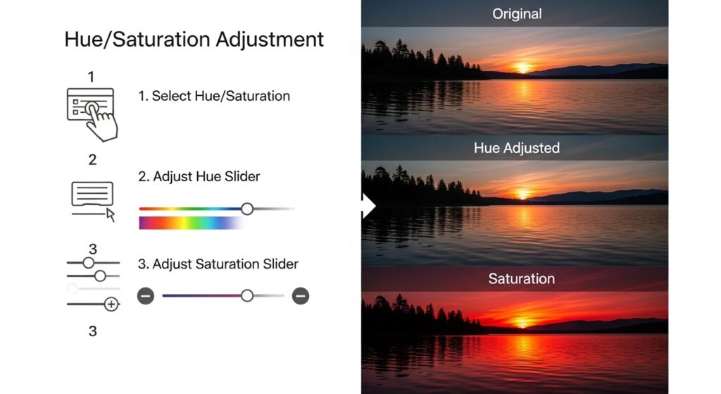
Using Adjustment Layers for Color Harmony
You achieve color harmony through adjustment layers. Create a new one by clicking the half-black-half-white circle at the layers panel bottom. Choose from options like Hue/Saturation or Curves.
Start with Hue/Saturation. This tool lets you shift entire color ranges. Select a master channel or target specifics like reds or blues. Slide the hue bar to match tones. Reduce saturation in overly vibrant areas to blend them seamlessly.
Curves offer finer control. Plot points on the graph to lighten or darken channels. Pull the red curve up to warm an image, or blue down to cool it. Preview changes in real-time.
Combine layers for complex edits. Stack Hue/Saturation over Curves. Use blending modes like Color or Overlay to integrate adjustments naturally.
For selective unification, add layer masks. Paint black on the mask to hide effects in certain spots. White reveals them. This technique unifies backgrounds while preserving subject colors.
Explore Vibrance for subtle boosts. It enhances less saturated colors without overdoing vivid ones. Adjust sparingly to maintain natural looks.
Targeting Specific Colors with Selective Tools
You target specific colors using the Color Range tool. Find it under Select > Color Range. Click on the hue you want to isolate. Adjust fuzziness to expand or contract the selection.
Once selected, create a Hue/Saturation adjustment layer. The mask automatically applies only to your choice. Shift the hue to align with surrounding tones.
The Magic Wand tool aids in quick selections for uniform areas. Set tolerance low for precision. Hold Shift to add multiple spots.
Refine edges with the Refine Edge brush. This smooths transitions, preventing harsh lines after color changes.
For objects, use the Quick Selection tool. Brush over the item, and Photoshop detects boundaries. Apply color overlays via Image > Adjustments > Replace Color.
Incorporate the Lasso tool for irregular shapes. Draw around the area, then feather the selection for soft blends.
Link to related techniques: Learn more about color changes in images for broader applications.
Advanced Techniques with Blending Modes
You elevate unification with blending modes. Set a layer to Multiply to darken and merge colors. This works well for shadowed areas needing depth.
Screen mode lightens, unifying bright highlights. Overlay combines both, enhancing contrast while blending hues.
Color mode applies hue and saturation from one layer to another’s luminosity. Duplicate your image, desaturate the bottom, and set the top to Color.
Experiment with Soft Light for gentle unification. It softens extremes without losing detail.
Group layers and apply modes to the group. This organizes complex edits.
Use Opacity sliders to dial in intensity. Start at 50% and adjust.
For inspiration, check Adobe’s resources on blending
Correcting Color Casts Effectively
You correct color casts by identifying dominant tints. Use the Info panel to sample points. Note RGB values; imbalances show casts.
Neutralize with Color Balance. Access it via adjustment layers. Shift sliders in shadows, midtones, and highlights separately.
Auto Color command provides quick fixes. Go to Image > Auto Color. It analyzes and adjusts based on algorithms.
For stubborn casts, use Levels. Clip black and white points per channel. Hold Alt while sliding to see clipping.
Threshold tool helps find neutrals. Set to 128, then sample grays for corrections.
White balance eyedroppers in Camera Raw unify raw files. Open via Filter > Camera Raw Filter.
Harmonizing Colors Across Multiple Images
You harmonize colors across batches for consistency. Use Match Color under Image > Adjustments.
Select a source image with desired palette. Apply to targets. Adjust luminance and color intensity.
Scripts automate this. Record actions in the Actions panel. Play on folders via File > Automate > Batch.
Bridge integrates with Photoshop for multi-image edits. Select files, then Tools > Photoshop > Image Processor.
Maintain unity in composites. Layer masks blend edges. Color overlays ensure seamless merges.
For web galleries, export with consistent profiles.
Tips for Efficient Color Unification
You speed up unification with presets. Save adjustment settings via the preset menu in layers.
Non-destructive editing preserves flexibility. Always use layers over direct image changes.
Zoom out frequently to check overall unity. Close views miss big-picture issues.
Calibrate tools regularly. Update Photoshop for new features.
Join communities for feedback. Share before-and-afters on forums.
Backup files before major edits. Use Version History in Creative Cloud.
Common Mistakes to Avoid
You avoid over-saturation by monitoring levels. Excessive vibrance creates unnatural looks.
Neglect masks, and edits bleed unwantedly. Always refine selections.
Ignore color modes, and prints mismatch screens. Convert profiles early.
Rush without previews. Toggle visibility to compare.
Forget undo history. Set it higher in preferences.
Over-rely on auto tools. Manual tweaks yield better results.
Integrating Unification into Your Workflow
You integrate unification early in editing. Address colors before cropping or retouching.
Combine with other tools like Dodge and Burn for depth.
In portraits, unify skin tones first. Sample averages and apply.
For products, match brand colors precisely. Use swatches.
Automate repetitive tasks with actions.
Export optimized files. Choose JPEG for web, TIFF for print.
Link to object-specific methods: Discover how to change the color of an object in Photoshop for targeted tips.
Exploring Creative Applications
You apply unification creatively in art. Turn photos into monochromatic schemes for mood.
In fashion, harmonize outfits with backgrounds.
Architects unify renders for presentations.
Experiment with gradients. Map them over images for effects.
Duotone filters unify via two colors. Access in adjustments.
Push boundaries with plugins like Nik Collection
Troubleshooting Persistent Issues
You troubleshoot by resetting preferences. Hold Alt+Ctrl+Shift on launch.
Check hardware acceleration in preferences. Disable if glitches occur.
Update graphics drivers for smooth performance.
For color shifts on export, embed profiles.
Test on different monitors.
Seek help in Adobe forums
Conclusion
You now possess the skills to unify colors in Photoshop effectively. Practice transforms theory into expertise. Apply these steps to your projects, and watch your images gain professional polish. Consistent colors engage audiences and convey messages clearly. Keep experimenting to discover personal styles.
Frequently Asked Questions (FAQs)
- What does unifying colors in an image mean?
Unifying colors involves adjusting hues, saturations, and brightness to create a cohesive palette. You eliminate clashes for a balanced, professional appearance in photos. - Which Photoshop tool works best for beginners in color unification?
Hue/Saturation adjustment layers suit beginners. You select color ranges and shift them easily without permanent changes. - How do I prevent color banding during unification?
Work in 16-bit mode. Access via Image > Mode > 16 Bits/Channel. This provides smoother gradients and reduces banding. - Can I unify colors in batch for multiple images?
Yes, use Actions or Batch processing. Record your steps, then apply to folders for consistent results across sets. - What causes color casts, and how do I fix them?
Lighting conditions cause casts. Correct with Color Balance or Curves, targeting shadows, midtones, and highlights separately. - Is Lab color mode better for unification?
Lab separates lightness from color, allowing precise adjustments without affecting brightness. Switch via Image > Mode > Lab Color. - How do blending modes aid in color harmony?
Modes like Color or Overlay merge layers seamlessly. You apply hues from one to another’s details for unified tones.